top of page
Grantchester - Series 4 - Art Dept. Assistant
After finishing my week as Junior Draftsman, I was asked to come back for the remainder of the production as the Art Department Assistant, as their Graphics guy was moving onto Stand By, and their current Art Department Assistant would be moving up to Graphics.I was there from the first week of filming, during which I was involved in petty cash buying, graphics, prop creation, drafting, set dressing, and much more! Below are a few bits and pieces of what I did in my time there...


One of the first tasks I was given as assistant was to make these Butterfly frames. I was asked to make 5; 1 to go up on one side of the hallways, as dressing (left) and 4 repeats (right) for Sidney to have his head smashed into...!
The repeats were tricky- I had to go and buy as many butterflies as I could that looked as close as identical as possible. I think I got pretty close!!
.png)
Episode 1 also featured to annual Church fete. I was asked to paint these huge canvas signs up. The designer wanted them to look as bright and colourful as possible, and hand painted- as if they were painted by the community. The blue sign was placed at the front of the fete set (see below), but sadly the director decided that the pink sign was a little too bright, and drew the audience's eyes away from the action a little too much, so it sadly didn't get used in the end.


A tin of mints was scripted to fall out of a character's pocket, so a label for the tin had to be made up. The buyer brought us two tins, and so I made up 2 options to be chosen from. I had to be careful to match up the colours and design of the graphic and the original tins.


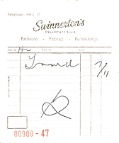


All through the series, various pieces of paperwork were required. I made an awful lot of them.
For the most part, I was given originals, either from istock sites, or from prop houses, which I had to scan in, remove the backgrounds and edit them for our purpose, to then print hundreds and hundreds onto different coloured papers for set dressing.


The Boxing Ring set required a lot of graphics dressing- plenty of posters for various fights, and general notices.
We were restricted to very minimal graphics, only being able to use text and basic graphics, where we could, both because of the cost and also because of the period. Despite this, I managed to come up with a range of posters.


The Maths Lab location had lots of cabinets which were to be filled with loads of electrical bits and pieces; wires, buttons, lights etc; to make them look like a huge computer.
With help from the assistant art director, I surveyed the location, including these cabinets, and drew them up in AutoCAD when we got back to the office.


The grandmother's room in episode 4 required some medicine bottles. The buyer provided me with some bottles from a prop house and I created these in Illustrator and printed them on sugar paper and attached them to the bottles.
.png)


In Episode 3, Geordie gives chase, and Leonard follows, but he bumos into a Cambridge Student, and sends all of his papers flying! I made up a load of student notes and printed multiple copies on different colour papers.

.png)


There were a lot of pub and bar scenes in the series, so a lot of bottles needed covering. While the graphic deigner made up the majority, I also made up a few and it was up to me to stick all the labels to the bottles.


Episode 6 is based around a school, and the teacher's office required some certificates making up. Here are the ones I made.


.png)
One of the main sets I created graphics for was the school, in particular, the two classrooms; Esme's classroom (left and below) and Mr Pope's classroom.
The two classes were to have very different things on their walls. Esme's was to be a little childish and a little haphazard. Above are some of the graphics I made for this. I created a lot of pieces that looked like they were hand-drawn, which we then printed off and coloured in by hand with colouring pencils and watercolour paint.
I also made some pages up that looked like they'd been take from a textbook, and a few pieces of homework, that we filled in by hand, to be distributed around on the desks.


Mr Pope's classroom (below) was very different to Esme's. It was very orderly, no colouring. The only artwork on the walls are some watercolour studies, which are exceptionally neat. I was tasked with scanning the original artwork in to crop and reprint them. The rest of the work on the walls is all neatly written blocks of text, a lot of which I typed out, either in typewriter font, or neat handwritten fonts. I was also tasked with drawing the frog dissection diagram on the blackboard in chalk, which I was rather proud of!
.png)

.png)

.png)

.png)
I also helped dress the two dance halls in Episode 6. For this dance hall, the graphic designer had got these silhouettes of dancers and music notes printed, and we spent a long time cutting them all out and dressing them around the room, some of them looking like they were dancing on musical staves!
The other dance hall I helped to dress was the school dance hall. This was to be the "aftermath" of the dance, and so to look like a complete mess. It was dressed with banners and decorations, and then we dressed other parts of the walls with posters.
.png)


The Police Station was the main set for the whole series. For series 4 they were completely redesigning it, as it needed bringing up to date. A location was found; a dilapidated building; which was then completely redesigned inside. One of the main things that needed changing a lot was the doors. I was tasked with redesigning the reception hatch. I was asked to survey the existing doorway, then draw it all up in CAD and create a Sketch Up model of it. This was my first time properly using Sketch Up, so I found it quite difficult, but achieved it anyway!

-1_j.jpg)
The other door I was tasked with changing was the Interview Room door. Again, I surveyed the existing door and drew it up. With help from various art department members, I then drew up various options for ways in which to turn it into a single door, and then we picked the best option. I believe in the end, ordinary frosted glass, as opposed to Georgian Wire was used for the door window, whilst the top was blocked off.
I also made a fair amount of bumpff graphics for the Police Station notice boards. Again, I was limited by basic graphics and text fonts, but I managed to create a fair few. Below are some of the ones I made.
.png)


.png)
I also helped with the general dressing of the set. It was a big set, so it was all hands on deck, but it looked fantastic at the end!
.png)
.png)

Overall, Grantchester was just a great learning curve for me. It was my first, long term TV job, and I got to do so many different things, and enhance my skills.
Not to mention, it was just very exciting to see my name in the credits at the end...!


bottom of page